It’s that time of the decade again
It happened in 2001, it happened in 2007, and now it’s happening again. The website is getting a new layout.
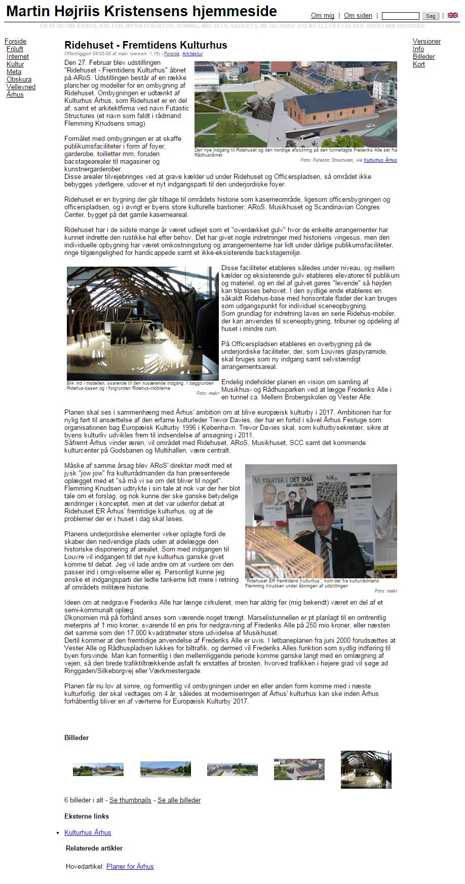 i
iI received an email from Google in the spring saying that my site had been downgraded because 100 per cent of the pages were poorly optimised for mobiles.
It didn’t really surprise me. I built the underlying CMS and the template half a year before the first iPhone was released, and over a year before I joined Facebook.
Everything in the old template was based on fixed-width tables (900 pixels wide) and very little was controlled by CSS. That was about a year before Chrome came out, and as far as I can remember, I was using IE.
I haven’t exactly spent much time on the site over the last five years, but as a matter of principle, I don’t think you should let things go offline, so I had a look around for a modern CMS.
My own CMS isn’t particularly advanced, but because the articles focus so much on projects in Aarhus, it supports two key features. The ability to assign KML geometries (e.g. a polygon or a line) to articles, with the aim of displaying them on a Google Map, and the ability to aggregate the geometries from multiple articles into an overview map for a category or feature article.
I looked at a number of different options, primarily relating to MediaWiki and Semantic MediaWiki, but in both cases it would have taken quite a bit of work to be able to display geometries.
Along the way, I also came across Symphony CMS, which is a fairly advanced CMS based on XML and XSLT. An exciting project, but rather time-consuming if you’re starting from scratch with XSLT.
In the end, I decided to tidy up my own code and implement a responsive layout. I came across Skeleton, which is a lightweight, CSS-based layout with a responsive grid and a very simple visual design.
Creating a responsive layout with modern CSS is actually relatively straightforward. Back in 2007, you could cover 95 per cent of users with simple HTML designed for a width of 900 pixels and tested on two or three desktop browsers. Now you can achieve the same coverage with a responsive CMS, but across very different platforms and screen sizes. Skeleton works out of the box on all mobile browsers and on all relevant desktop browsers from IE9 onwards. With Respond, you also get support for IE8. Anything before that is hopeless. You don’t even get graceful degradation; there are outright errors because various CSS and JS elements aren’t backwards-compatible. That’ll have to do for now.